project details
details, descriptions, and notes for my projects
Writing Assistant
Tech used
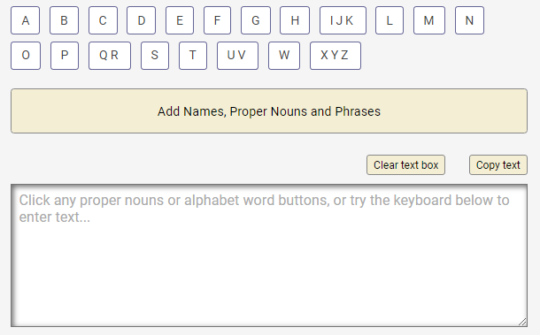
I built this app for people who have reduced fine motor skills and difficulty in speaking (e.g., brain injuries, cerebral palsy, stroke survivors). My hope is that it will be easier for them to compose emails to family, friends, and former co-workers.
Take a look at the code on GitHub or try out the live version. There are modifications that can be made to tailor the app for each person. Feel free to contact me for help with that.
As for the code, this was originally a Vanilla JS app but I converted it to TypeScript. I plan to add
Tailwind CSS, add a language select list defaulted to en-us, and populate the DOM based on
the language selected.
How I built this app
WORDS & PHRASES
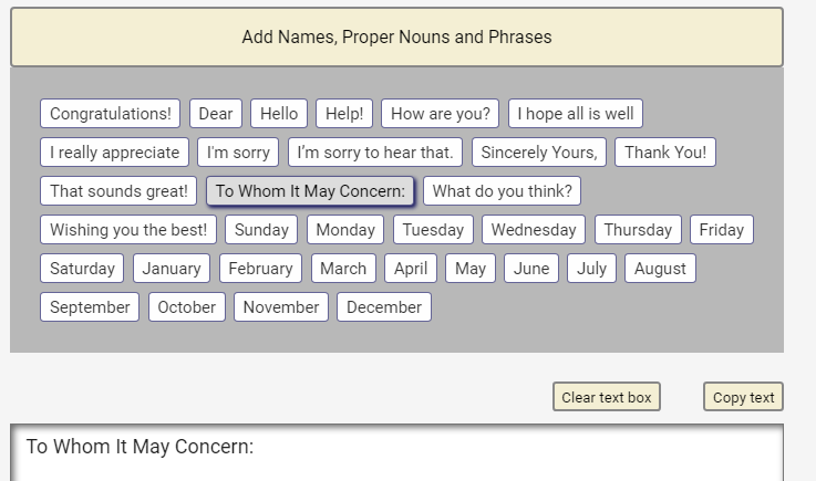
Instead of having to type every character, I use RegEx to create arrays for 1) common words by letter, and 2) common phrases (in content.js). I then map thru those arrays and output the words into a menu for each letter of the alphabet letter, and an accordian for the phrases.
KEYBOARD
I have functions for alphanumeric characters, navigation, and non-print keys (Spacebar, Enter, Tab). I also have functionality for Caps and Shift keys for changing the characters added to the textarea based on the state of those keys.
TEXTAREA
All words, phrases, and keyboard characters get added to the textarea on click. Further manipulation of the text in the textarea is accomplished using the Delete and Backspace keys, which can be used with the Navigation keys (Home, End, Arrow-Left, Arrow-Right).
CLIPBOARD & MODAL
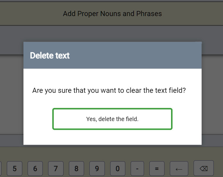
There is also a button to copy the textarea content to be pasted into a document or email program. Finally, there is a Clear button to empty the textarea with a modal for confirmation to prevent accidental deletion.
Is the app complete?
No. I would like to use the File API so that users can upload a file of proper nouns and sample text so that they can have a custom-built page. I would also like to create keyboards for other languages.
Final thoughts
It is essential to have a clear plan of what you want to accomplish. As I built the app, I added feature after feature which required changes to the CSS and HTML. Planning out the full-featured app would have been better.
Guitar Chord Namer
Tech used
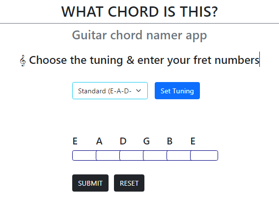
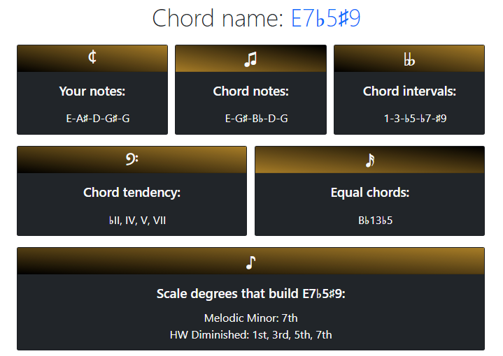
This app returns the name of a guitar chord, the chord intervals, the chord tendencies, whether or not it equals another chord by a different name and the scales that build the chord.
You won't find a more accurate and complete guitar chord namer app! If you or someone you know plays guitar then try out the app on my guitar website or check out the code on GitHub.
I started this project after viewing SVG Guitar Chord repos on GitHub and noticed that their names were often wrong.
This is a Vanilla JavaScript app that uses Bootstrap for most of the styles and custom CSS for other elements like the card background gradients.
How I built this app
OVERVIEW
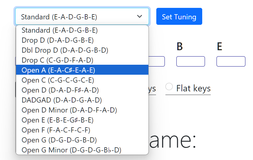
The user has to enter the fret numbers for the chord they need to be named. They also have options to choose one of thirteen tunings (Standard default), and to choose a sharp or flat key (sharp default). The tuning chosen populates the DOM with the notes for each string and the notes are used to build string arrays.
BUILDING ARRAYS AND OBJECTS
Based on the tuning and the sharp/flat checkbox, all 6 strings are built with the correct notes.
Duplicate user notes are then filtered out, intervals are created with each unique note as a chord root.
The intervals are converted
into an object and that object is used to find a match in chord-intervals.js.
SPECIAL CASES
If at least one matching chord was found with the same number of notes, I perform 7 conditionals for what in music is known as enharmonic equivalents. The conditionals are not complex, but without these checks, the output field "Chord notes" would sometimes have the wrong notes.
FINISHING TOUCHES
I have a number of small code blocks to put the Chord Notes in "proper" order, create a slash chord or
not, and check to
see if the notes are equal to 2 or more chord names. Then I get the chord tendency and chord intervals
values from
chord-intervals.js and finally write everything to the DOM.
Is the app complete?
This app is complete for its purpose but it can be much better. I would like to have an option for ukeleles, banjos & mandolins. I also intend to load the users' tuning and sharp/flat selections into local storage, and finally create an SVG chord shape based on the users' notes.
Final thoughts
A lot of the description above references music theory, so I apologize for that. But music theory had to be incorporated to make this app do what it does, and to handle all the edge cases to return the correnct chord name.
Tarp Configurations
Tech used
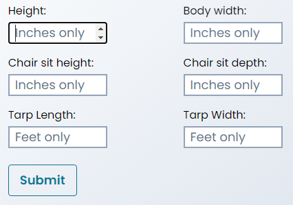
This is a personal project that aligns with my interests in bushcraft and wilderness survival. It calculates the height of the rope(s) used to raise your tarp for 33 different tarp configurations.
It also notes whether the user is able to 1) sit under the tarp, and 2) sit in a chair under the tarp.
This app uses React for the state of the user's input values which are used for the calculations, and Tailwind for the styling. You can try out the app on Netlify or take a look at the code on GitHub.
Why I built this app?
Bushcraft is a hobby of mine and one aspect of it is using and setting up tarps. Each tarp setup/config requires different heights and angles for the setup. So I felt this would make a great personal project. This app would be useful for campers, backpackers, bushcrafters, or anyone who has struggled trying to raise a tarp into the air for protection against the elements.
Challenges encountered
I had to build my first responsive Hamburger menu and back-to-top button in React, and since I did not
use create-react-app I had issues loading my images. I did some research for the image issue
and found that without Webpack I needed to import the images into my files. Lastly, I had to design the
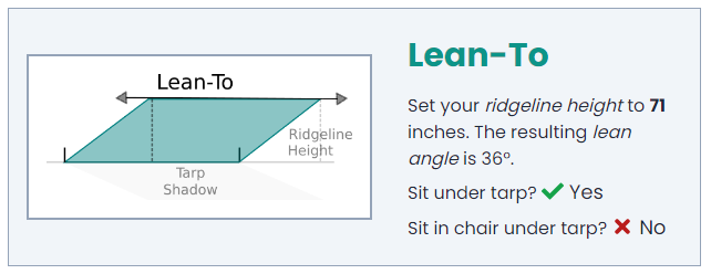
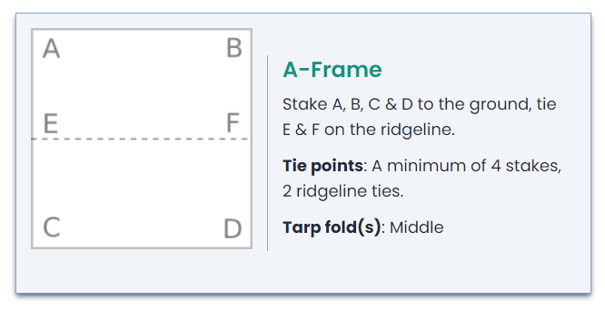
tarp graphics in Inkscape, as close to 3D as my skills allowed.
Is the app complete?
Almost. The app does what it is supposed but I would like to add some options for the users. The first would be to let the user enter the tarp size in inches or feet. I would also like to have an option to set all the fields to metric that accept centimeter/meter values.
Final thoughts
Using useContext was better than useState but I would like to incorporate
useReducer for my state values. I
would also prefer to create my own webpack.config file for greater control.
Client Work
Tech used

The details below are not what I would call projects, but are rather the steps I took to help different website owners.
I have done unpaid volunteer work for two WordPress site owners. Another client is from Fiverr who was unfamiliar with how WordPress works and built his website using a block theme.
Another Fiverr client had a simple request involving HTML. Specifically, that client provided me with PDF
files with tables that needed to be converted to HTML <table> elements.
As I get other clients for any type of website needs, I will add a short summary of the details for each job. Here are summaries for the 4 clients mentioned above.
#1 Camping Ventures Hub
The client's website Camping Ventures Hub was an affiliate marketing blog. The job had 2 milestones, the first for determining why the domain would not load, and the second for building or "fixing" 5 more pages.
The client chose a Block theme named Yith Wonder but he was unfamiliar with WordPress and so knew nothing about the admin area, Gutenberg blocks, or block themes.
He also configured the WordPress admin area incorrectly and had his host company create a staging area which was totally unnecessary for a brand new website with no pages.
Issues and the Solutions:
1. Issue: The staging area link worked but the domain link was timing out.
Solution: I noticed that the client added the staging area link in the Site Address and WordPress Address URL fields which means his domain had no pages. Bluehost fixed the error.
2. Issue: Home page images were 100's of kilobytes. They were sized to 800px wide but displayed at ~ 300px wide.
Solution: I brought the images into Photoshop, reduced the size, optimized them for the web, and then uploaded the new lightweight images to the media library.
3. Issue: The footer lacked the elements and styling that the client wanted.
Solution: I edited one of the footer template files and added the current elements including the newsletter form that I created.
4. Issue: The header lacked a proper menu with links to the category pages.
Solution: I created the categories since they did not exist and then added them to the header menu.
5. Issue: There were no blog posts to see the styling for the blog page, categories pages, or single post pages.
Solution: I created a single sample post for each category which allowed us to see how the templates displayed on the front-end.
6. Issue: The Home, Archive, and Single templates had limited styling and needed layout changes.
Solution: I edited the templates per the client's requests for the features and styles he wanted.
7. Issue: No favicon.
Solution: I brought his logo into Inkscape, removed the wordmark, and used just the graphic as the favicon.
8. Issue: The client's lack of knowledge of WordPress.
Solution: I created a draft post with notes about the template files, Gutenberg blocks, and theme options so that he would be able to continue building the site on his own.
#2 propMeUp
The client's website propMeUp is a non-profit charity site that was started by a WordPress designer from Fiverr but who abandoned the project.
The owner was on a timeline to obtain funding for the charity and 3 pages needed to be built and the images on the other pages needed to be replaced.
The additional issue for the client is that the site was built using the page-builder Elementor and the original designer installed a dozen plugins in support of Elementor.
This was a volunteer job for a person in my local area who had no knowledge of WordPress let alone Elementor and a host of plugins.
Issues and the Solutions:
1. Issue: The Events and Contact pages had not been created and therefore lacked content.
Solution: I created the pages, copied design elements from the Join page, and then made edits. I also created a contact form with custom CSS.
2. Issue: The Home and About pages had spacing, font size, and many other issues.
Solution: I changed the padding, margin, font size, and changed the layout until the
client was happy. I then applied those styles to every other section and page throughout the site. The
previous designer used pixels for everything — I replaced px with em and
rem.
3. Issue: The sticky header was unreadable due to reduced opacity on scroll.
Solution: I deleted the header and built a simpler header that was not sticky. The site had a back-to-top button so a sticky header was not needed.
4. Issue: The testimonials slider had the text obstructed by the ornamental double-quotes “ on small screens.
Solution: Elementor had different slider options so I switched to another design that did not have any issues.
5. Issue: The images on the pages needed to either be changed or minimized. The image sizes were in the Megabyte range.
Solution: I downloaded every image and reduced the filesize using Photoshop then uploaded the smaller files and used them on the pages.
6. Issue: There were many plugins that were installed in support of Elementor.
Solution: I migrated the site onto my local machine and then systematically disabled every plugin to see if there was any loss of functionality or styling. I removed all the plugins that were not needed.
7. Issue: No favicon.
Solution: Luckily the client hired a graphic designer who did a great job and had a version of her logo with just the UP and up arrow (see website). I resized that and used it for the favicon.
8. Issue: The client's lack of knowledge of WordPress and Elementor.
Solution: We did a number of Slack Huddles where I shared my screen and explained how to work with Elementor.
#3 Two Average Gamers
This was another volunteer opportunity that I found on a job board named Flexjobs for Two Average Gamers. My job was to improve the page speed and to look at the overall design and page structure. I was not able to do much for the design but I did address the other 2 issues.
The Google Insights Performance score was in the mid to low 40% range. I was able to get it as high as 73% until it settled at 69-70%. The main drag on the page load speed was Mailchimp (free version) loading the enrtire jQuery librrary.
The site also had multiple Contact, About, and other duplicate pages. They site owners were unaware of this. I created the code for 301 redirects and I talked them through how to add it to their cPanel .htaccess file.
#4 Lift Master
This was another Fiverr gig for someone from Lift Master. I had to convert 7 tables in a PDF file to HTML elements.
I did create an excellent responsive table design but this job only required using a number of
rowspan and colspan attributes.
I copied the text from the PDF files and pasted it into a markdown file. Then I created the
table element with thead and tbody tags, and with no content in the
td, tr, and th tags. Then it was just a cut/paste process making
sure that my table text matched exactly what was in the PDF files.

